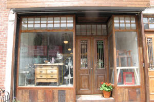
Ever stop and notice how storefront architecture has changed considerably over the years? Well, you’re the only one! The bigger question is who’s the winner? Is it right to stick with a traditional ancient storefront or transition to a modern commercial storefront? A storefront is undeniably the most important architectural element of any business, and is the first thing people look at before even looking at your actual products. So its appeal definitely makes a significant impact on potential customers. If you need a storefront window glass, Ace Glass can help.
Historic Storefronts:
Businesses in the 18th and 19th centuries were mostly located on the lower and ground floors of buildings. Owing to their close proximity from the ground, these commercial establishments were often fitted with residential style scaled windows and doors in an effort to blend in with the surrounding residential houses. However, in some cases, large oriel or bay windows that consisted of smaller panes of glass were used to make the shops distinct from residential properties. Adding to this, awnings of canvas and wood and signs set alongside the sidewalk were some of the design elements that were also used by a few commercial establishments.
The ground floors of large commercial businesses particularly the ones seen in the early 19th century were outfitted with heavy stone or brick complete with small paned window sash or paneled doors. Storefronts were a critical component of the facade, but were not given special attention, although some were wider than other openings. Storefront architecture received its first major design improvement with the introduction of cast iron in the 1940’s. Builders and architects began to add cast iron to lintels and iron columns on the ground floor level.
Simultaneous innovations in the glass industry made it possible to manufacture large glass panes at affordable costs. The storefronts you know today are a combination of these two technical achievements – large expanses of glass bordered by thin structural elements. The typical 19th century storefront comprised of single or double doors flanked by display windows. The entrance of these storefronts was frequently recessed to protect customers against inclement weather, and also to increase the amount of real estate used to display merchandise.
The sign board then became a prominent part of the building with wooden canopies and canvas awnings located directly underneath. Decorative transom lights were used to highlight merchandise in the early 20th century, which in some cases could be opened to increase air circulation into the store. Storefronts today are all about branding the company through architecture. A couple examples of enhancing the prestige of a brand through retail design are the Apple Store in Manhattan and Prada Store in Tokyo.
Bottom line is that breathtaking design can exist in any period so it is important to evaluate if your current storefront is worthy of preservation or would it be better off if transformed into one of the many modern designs.

